A (mostly) daily updated list of things I learn/read
- Logs, metrics, traces, and exceptions can be clubbed into Telemetry Signals.
- Fully embrace OTEL in our codebase and use Jaeger as the preferred trace visualization tool.
- FE tracing needs to be included in the entry chunk of a page to monitor page load telemetry.
- Initial value addition with FE tracing - being able to see bottlenecks, inefficiencies, and so on.
- Present Value proposition - insights such as analyzing the costs of services and components, detecting incidents, responding to them, and assessing their impact.
- Any task that takes more than 50 milliseconds to run is considered a long task.
- Device must create a new frame every 16 ms (~60fps)
- Additional time for other tasks while maintaining smooth visual experience.
-
Aim: Minimize long tasks (duh!)
- Total Blocking Time = TTI - FCP
- The Interaction to Next Paint (INP), a new Core Web Vitals metric, measures the time from a user’s first interaction with the page (e.g. clicking a button) to when this interaction is visible on-screen; the next paint.
- INP is important for site like e-commerce with a lot of user interactions.
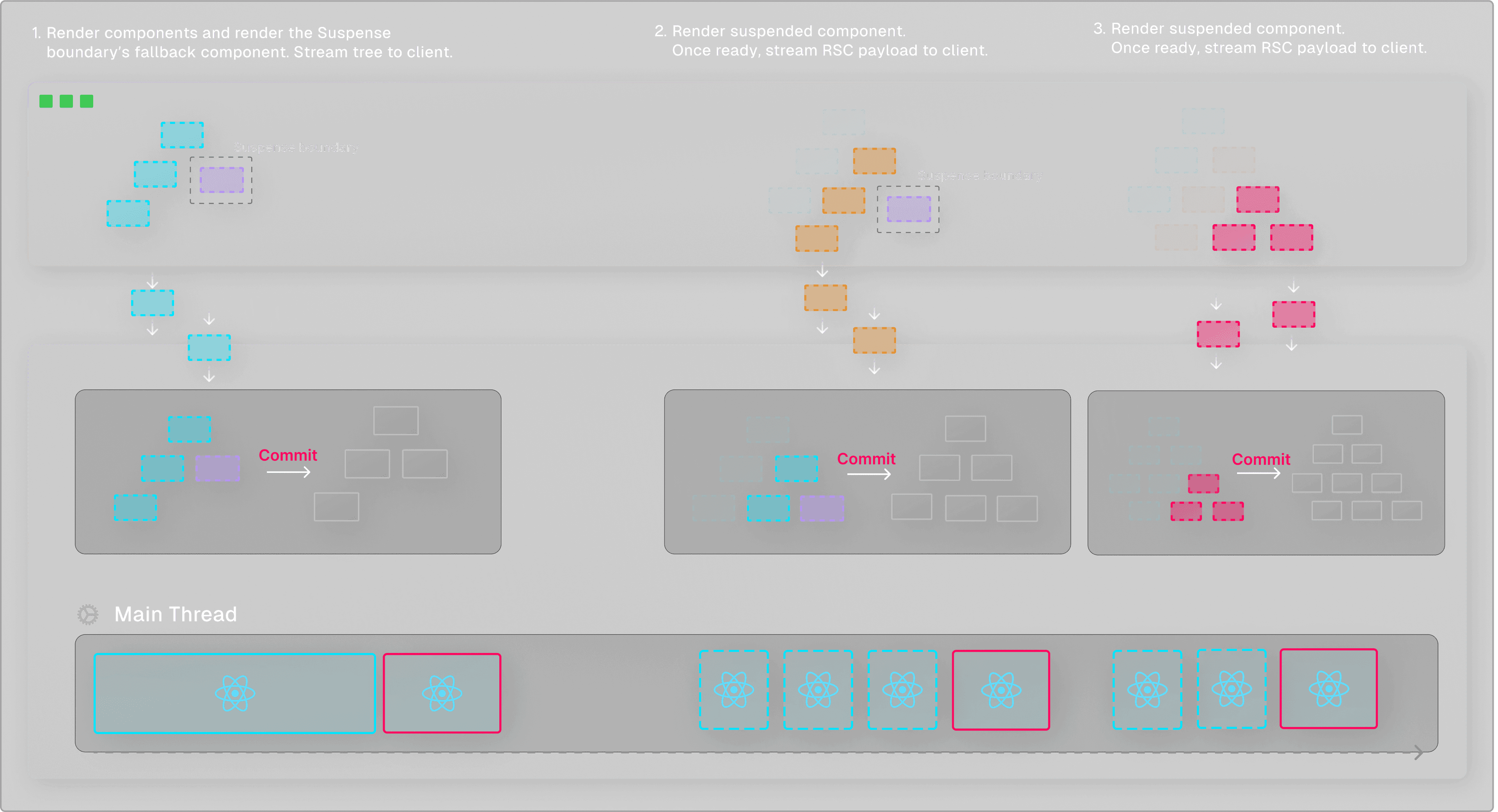
- A visual update in React is divided into two phases: the render phase and the commit phase.
- During the render phase, React calculates the differences between the current DOM and the new React component tree and prepares the necessary updates.
- In the commit phase, React applies the updates.
- A synchronous render is an “all-or-nothing” operation, where it’s guaranteed that a component that starts rendering will always finish.
-

- React 18 introduces a new concurrent renderer that operates behind the scenes. This renderer exposes some ways for us to mark certain renders as non-urgent
-

- React will yield back to the main thread every 5 milliseconds to see if there are more important tasks to handle.
- By continuously yielding back to the main thread, React is able to make such renders non-blocking and prioritize more important tasks.
- We can mark an update as non-urgent by using the
startTransitionfunction made available by theuseTransitionhook. - Transitions enable React to render multiple versions of the UI concurrently, and manage priorities between different tasks.
- It’s up to the developer to optimize bundle size when working with Client Components and RSC. Developers can do this by:
- Ensuring that only the leaf-most node of the interactive component defines the “use client” directive. This may require some component decoupling.
- Passing component trees as props rather than importing them directly. This allows React to render the children as React Server Components without adding them to the client bundle.
- Using
Suspensein combination with React Server Components allows us to directly access server-side data sources without requiring a separate API endpoint, such as databases or the file system. - When a component is suspended, for example because it’s still waiting for data to load, React doesn’t just sit idle until the component has received the data.
- Instead, it pauses the rendering of the suspended component and shifts its focus to other tasks.
- The combination of
Suspensewith React Server Component’s streamable format allows high-priority updates to be sent to the client as soon as they’re ready, without waiting for lower-priority rendering tasks to complete. - Not exactly seeing that same organic adoption happen as had happened for
SASS - I still use media queries for responsive layouts but tend to reserve them for “bigger” layouts that are made up of assembled containers. Otherwise
container-queriesis preferred. - With :is(), specificity is determined not by the main selector but by the most specific selector in its argument list.
/* Specificity: 0 1 1 */ :is(ol, .list, ul) li {} /* Specificity: 0 0 2 */ ol li {} - Use prefers-reduced-motion to slow everything down when that’s the preference.
- Using
css variableswithcolor-functionsis a powerful idea::root { /* Primary Color HSL */ --h: 21deg; --s: 100%; --l: 50%; --color-primary: hsl(var(--h) var(--s) var(--l) / 1); } .bg-color { background: var(--color-primary); } .bg-color--secondary { --h: 56deg; background: hsl(var(--h) var(--s) var(--l) / 1); } -
The type of traffic for such events can be extremely spiky. A very steady traffic volume can suddenly spike when Mbappe scores the goal that ties the game.
-
Understanding the traffic:
-
- Where the traffic is coming from and where it needs to go.
-
- The different byte sizes of requests.
-
- How many users to deliver traffic to and what the per-user traffic pattern will be.
-
- Expected QPS fluctuations throughout events.
-
- Whether there will be concurrent events.
-
In the case of the World Cup, past competition figures combined with predicted organic growth helped us make a good prediction of the type of traffic and load we could expect.
-
To shed some light on the scale of the 2022 World Cup, we delivered over 115B notifications to over 400M users across the globe. During the Argentina - France kick-off, we reached a peak of 46M QPS from our average baseline of 18M in a matter of seconds.
-
Cold Potato Routing - whenever feasible, try to provision infrastructure as close as possible to the source and destination of the traffic, so you can get requests in and out of your system more quickly while controlling the
QoSandlatenciesin between. -
Always provision infrastructure in a redundant manner between clusters that share no dependencies
-
Try also to provision in new cloud domains from the ones you’re currently in.
-
Load Balancing - Isolated Infra - If the
URLfor the new traffic is known upfront, try and provision new Infra just for those newURL's -
Sometimes, isolating the traffic entry point to your system will be sufficient.
-
Start with mostly static HTML. If you’re building a blog or a marketing site or something like that, your journey can often stop here. Grab a tool like 11ty or Hugo and you’re good to go!
-
Progressively enhance the dynamic parts. Have some API-driven content? Static-site generators can fetch that for you, too. But if it’s user-dependent or has to run in the browser, use JavaScript for just the parts that require it.
-
Pick small, focused tools. Is your dynamic content rendered once and then done? Just use vanilla JavaScript. Does it get updated with user interactions? Grab a smaller state-based UI library like Preact or Solid instead of one of the big monolithic tools.
-
If your content is mostly image-based, pixels might make the most sense. If your content is mostly text-based, it probably makes more sense to use a relative unit that’s based on text size, like
emorch. -
It’s best to choose your breakpoints based on your content rather than popular device sizes, as those are subject to change with every technology release cycle.
-
You can combine media queries so that the styles only apply when all the conditions are true.
-
Long polling is a technique where the server elects to hold a client’s connection open for as long as possible, delivering a response only after data becomes available or a timeout threshold has been reached.
-
With long polling, the client may be configured to allow for a longer timeout period (via a Keep-Alive header) when listening for a response – something that would usually be avoided seeing as the timeout period is generally used to indicate problems communicating with the server.
Source: https://www.canva.dev/blog/engineering/end-to-end-tracing/
Link to TILimport { useTransition } from "react";
function Button() {
const [isPending, startTransition] = useTransition();
return (
<button
onClick={() => {
urgentUpdate();
startTransition(() => {
nonUrgentUpdate()
})
}}
>...</button>
)
}
Source: https://vercel.com/blog/how-react-18-improves-application-performance
Link to TILSource: https://www.smashingmagazine.com/2023/07/writing-css-2023/
Link to TILHow Firebase scaled up to deliver messages diring world cup season

Source: https://firebase.blog/posts/2023/05/cloud-messaging-world-cup-scale
Link to TILSo, how do you actually build a lean, efficient site in 2023?
Source: https://gomakethings.com/how-to-build-lean-efficient-websites-in-2023/
Link to TILUnits in Media queries
@media (min-width: 50em) and (min-height: 60em) {
  article {
    column-count: 2;
  }
}
Source: https://web.dev/learn/design/media-queries/
Link to TILLong Polling
Source: https://ably.com/topic/long-polling
Link to TIL